Brand Strategy Project Overview Elevate Medicine Collective was looking for a dynamic logo design signifying a...
Read More
About
Problem
Solution
Key Visuals

Exploring Options
The reason for this discussion is to expose a bunch of designs with logos that use compasses, page corners, and girlish elements. The principal phase was focused on delimiting 2 distinct color compositions.

Client Feedback & Refinement
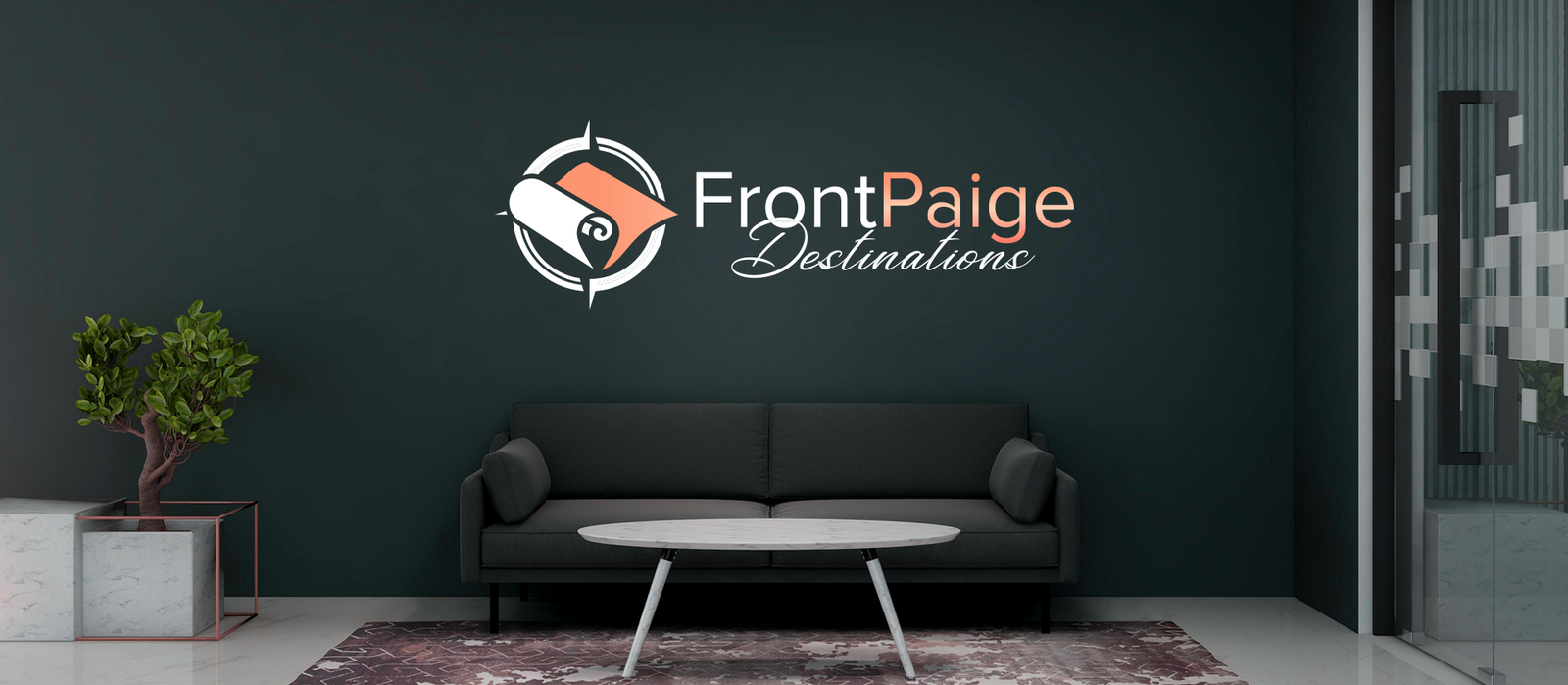
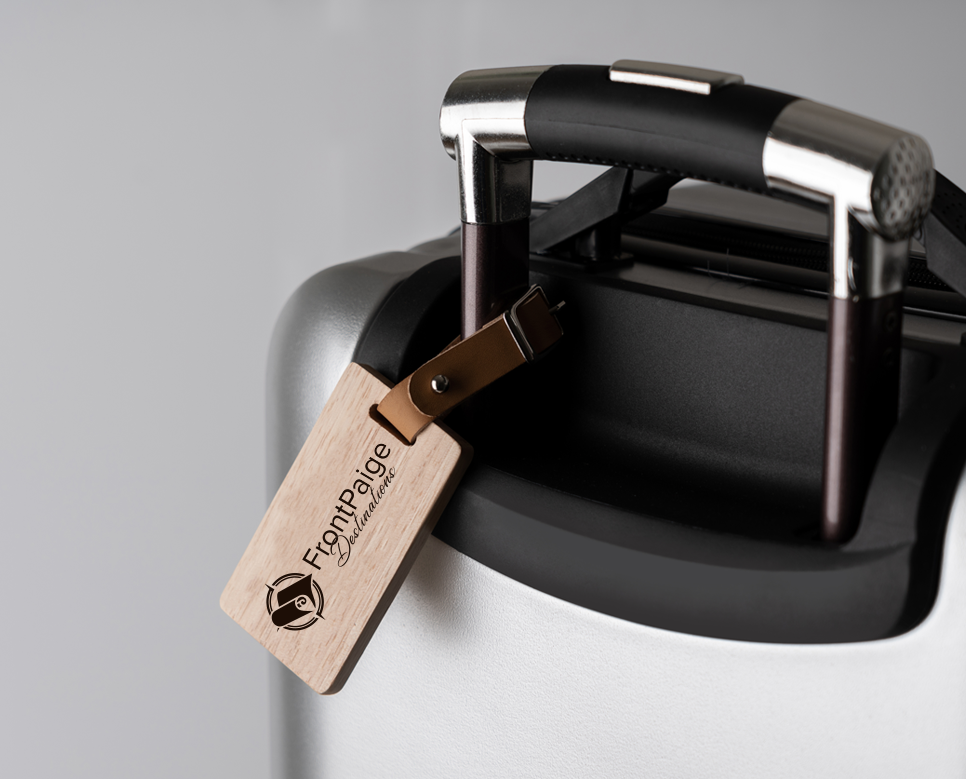
We had a feedback sessions and communication to make the logo better and finally it became the one that evokes the brand of FrontPaige Destinations well.

Bold Adventure
We thought about using blue in our emblem to convey the impression of reliability and steadfastness while introducing the grays to add class and sophistication. It was also considered to add orange into the logo in order to inject energy, adventure, and enthusiasm.

Sophisticated Explorer
This palette was a mix of blue, rose gold and white. Tear green brought to mind a soothing green and adventurous vibe, and the pale gold evoked a more gentleman-like energy and the white created clean lines.

Logo Meaning

Typography
The logo uses a typeface which is a combination of two fonts. Scrip font of “FrontPaige” ” adds a touch of sophistication and elegance, while the clean sans-serif font for “Destinations” offers improved legibility.
Poppins
Medium
Aa Bb Cc Dd Ee Ee Gg Hh li Jj Kk LI Mn Nn Oo Pp Rr Ss Tt Uu Vv Xx Yy Zz



Safe Area
Want to outshine your competition?
Reach out to MultiverseSol and let us guide you towards digital goals.
Your success story starts now!
Explore More Case Studies
Mcgrill & Hill Group
Project Details The primary objective of this project was to breathe new life into the existing...
Read MoreTaege Law Offices
Brand Strategy Project Overview MultiverseSol was tasked with the rebranding of Taege Law Offices, a boutique...
Read More
