The primary goal for this project was to design a logo for “Kut The Stigma” podcast,...
Read More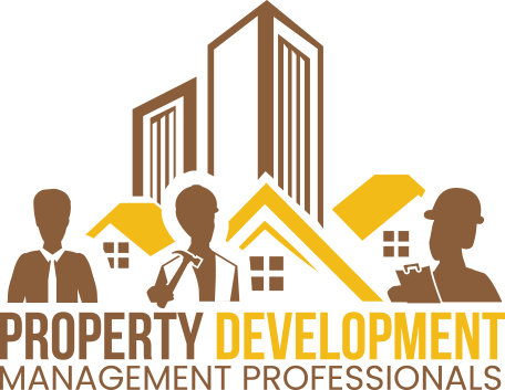
Project Overview
Property Development Management Professionals (PDMP) is a prominent entity in the real estate industry known for its exceptional property management services. With a passion for excellence and a commitment to delivering top-tier solutions, PDMP sought to revamp its brand identity to reflect its innovative approach and professional attributes.
Our collaboration with Property Development Management Professionals exemplified MultiverseSol’s expertise in crafting a logo that smoothly captured the essence of the property management industry while accommodating specific client requirements, including adaptability for embroidery. Through a vast exploration of design elements, we seamlessly integrated symbolic representations of construction, professionalism, and planning, creating a balanced logo that reflected the brand’s values.
The Company
At MultiverseSol, we pride ourselves on delivering top-tier digital solutions, catering to the diverse needs of our esteemed clients. Our recent venture with Property Development Management Professionals exemplifies our commitment to excellence and creativity in logo design, a fusion of innovation and precision that is something we still cherish.
PDMP desired a dynamic and distinctive logo that encapsulated its multifaceted expertise in property development and management. The client specifically requested the incorporation of three key elements – a hard hat, a tie, and a clipboard – symbolizing the core aspects of their work. Additionally, the color palette was to reflect the warm tones of autumn, representing growth and stability, with a preference for a larger, simplified logo that could be embroidered on clothing without losing its essence.
Creative Process
Carefully considering the client’s feedback, we refined the initial design, focusing on amplifying the prominence of the central building while simplifying the intricate details of the figures. Our designers skillfully integrated the requested hammer into one of the figures, emphasizing the tradesmen aspect, which is pivotal to PDMP’s operations.
Logo Elements


Metaphor Resources
Inspired by the fundamental pillars of the property management industry, we employed metaphors that reflect the core values of construction, leadership, and meticulous planning. The combination of the hard hat, tie, and clipboard served as potent symbols, embodying the dedication, professionalism, and attention to detail that define Property Development Management Professionals.
Idea Exploration
Our journey towards the final logo involved a process of continuous refinement and creativity. The incorporation of client suggestions and feedback propelled us to explore various iterations, each aimed at striking the delicate balance between intricate detail and simplistic elegance. The evolution of the logo was a testament to our unwavering dedication to exceeding client expectations and delivering a design that speaks volumes about the brand identity.

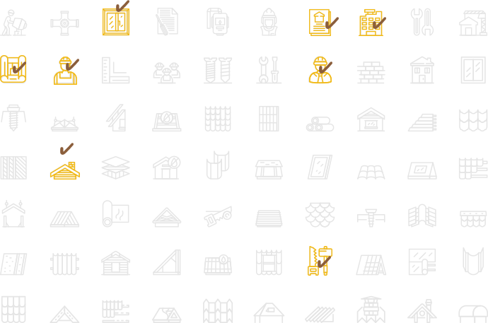
Logo Elements
Aa
a b c d e f g h i j k l m n o p q r s t u v x y z
0 1 2 3 4 5 6 7 8 9 0 . , <> : ? () {} []
Oswald Medium
Aa
a b c d e f g h i j k l m n o p q r s t u v x y z
0 1 2 3 4 5 6 7 8 9 0 . , <> : ? () {} []
Poppins Regular
Color Palettes
Drawing inspiration from the vivid autumn landscape, our choice of the yellow & brown Color Palette was a conscious effort to infuse warmth, stability, and a sense of harmony into the logo. The addition of a subtle brown tone brought a touch of tranquility and balance, underscoring the brand’s commitment to trustworthiness and dependability.
Primary Colors
RGB 139, 94, 59
HEX #8b5e3b
Secondary Colors

CMYK 20, 50, 73, 3
RGB 199, 135, 86
HEX #c78756

CMYK 1, 14, 20, 0
RGB 251, 221, 199
HEX #fbddc7
Primary Colors
RGB 243, 187, 23
HEX #f3bb17
Secondary Colors

CMYK 1, 18, 84, 0
RGB 255, 207, 67
HEX #ffcf43

CMYK 1, 6, 38, 0
RGB 255, 234, 174
HEX #ffeaae
Preview
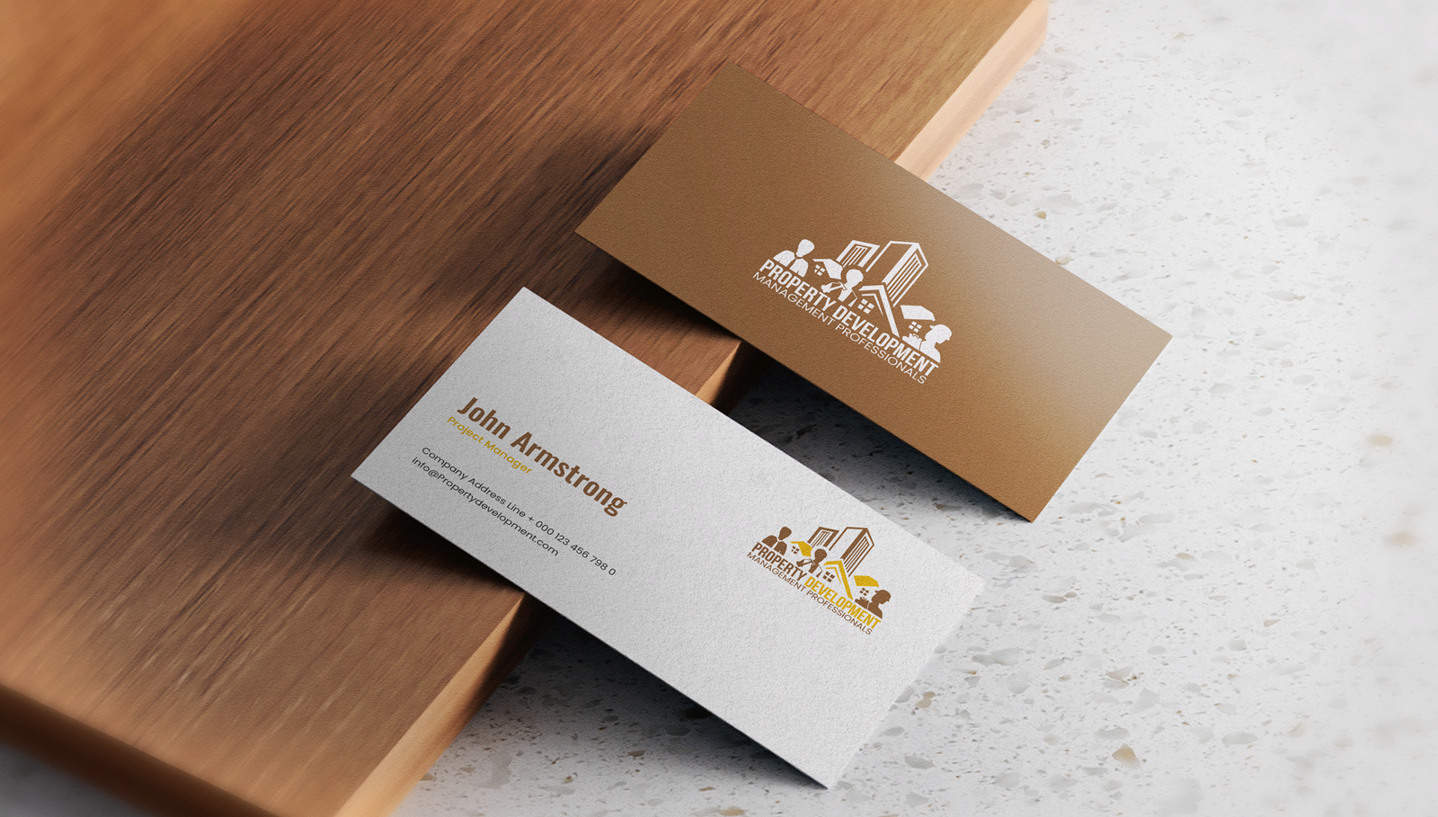
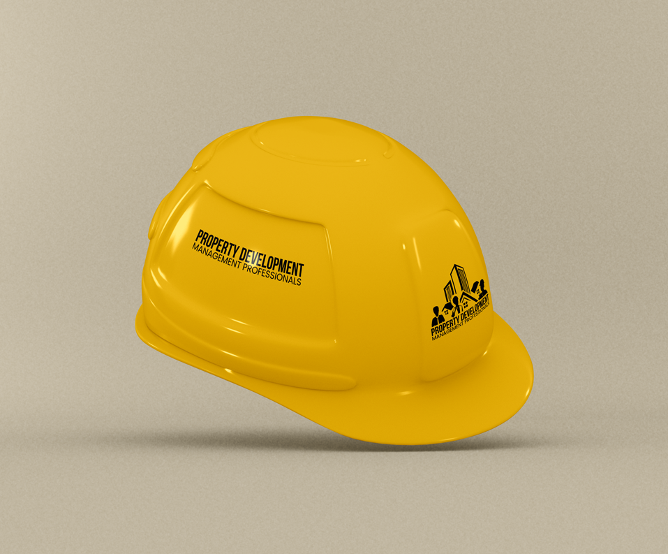
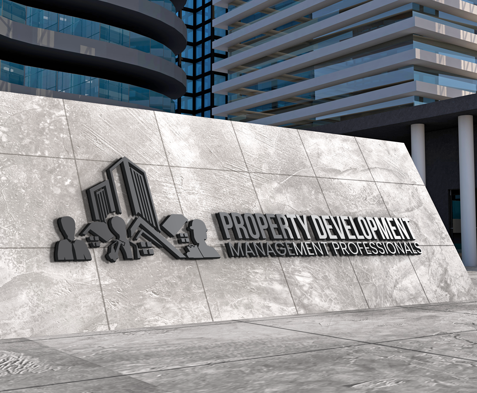
In response to the client’s valuable insights and preferences, we tailored the logo, enhancing the prominence of the building, simplifying the representation of the professionals, and ensuring that the design remained easily adaptable for embroidery. The final version stood as a testament to our adaptability, creativity, and commitment to delivering excellence while meeting the unique demands of our clients.

Want to outshine your competition?
Reach out to MultiverseSol and let us guide you towards digital goals.
Your success story starts now!
Explore More Case Studies
Taege Law Offices
Brand Strategy Project Overview MultiverseSol was tasked with the rebranding of Taege Law Offices, a boutique...
Read MoreLiving & Loving Life
Living & Loving Life The Introduction Diane, an aspiring author, approached MultiverseSol with a heartfelt memoir...
Read More