The Phoenix Cannabis Co., a burgeoning high-quality and premium marijuana brand and dispensary based in Phoenix, AZ, sought a distinctive and ownable logo as part of its rebranding initiative. Targeting a shift from a middle to low-end customer base, the objective was to attract a clientele demanding superior quality while maintaining an authentic, local, and enjoyable brand image.
Problem
The existing customer base was not aligned with the desired brand image. The challenge was to create a logo that conveyed high quality and premium status without appearing luxurious or pretentious. Additionally, legal constraints prohibited the use of a Phoenix (bird) icon, necessitating a unique and identifiable design.
Solution
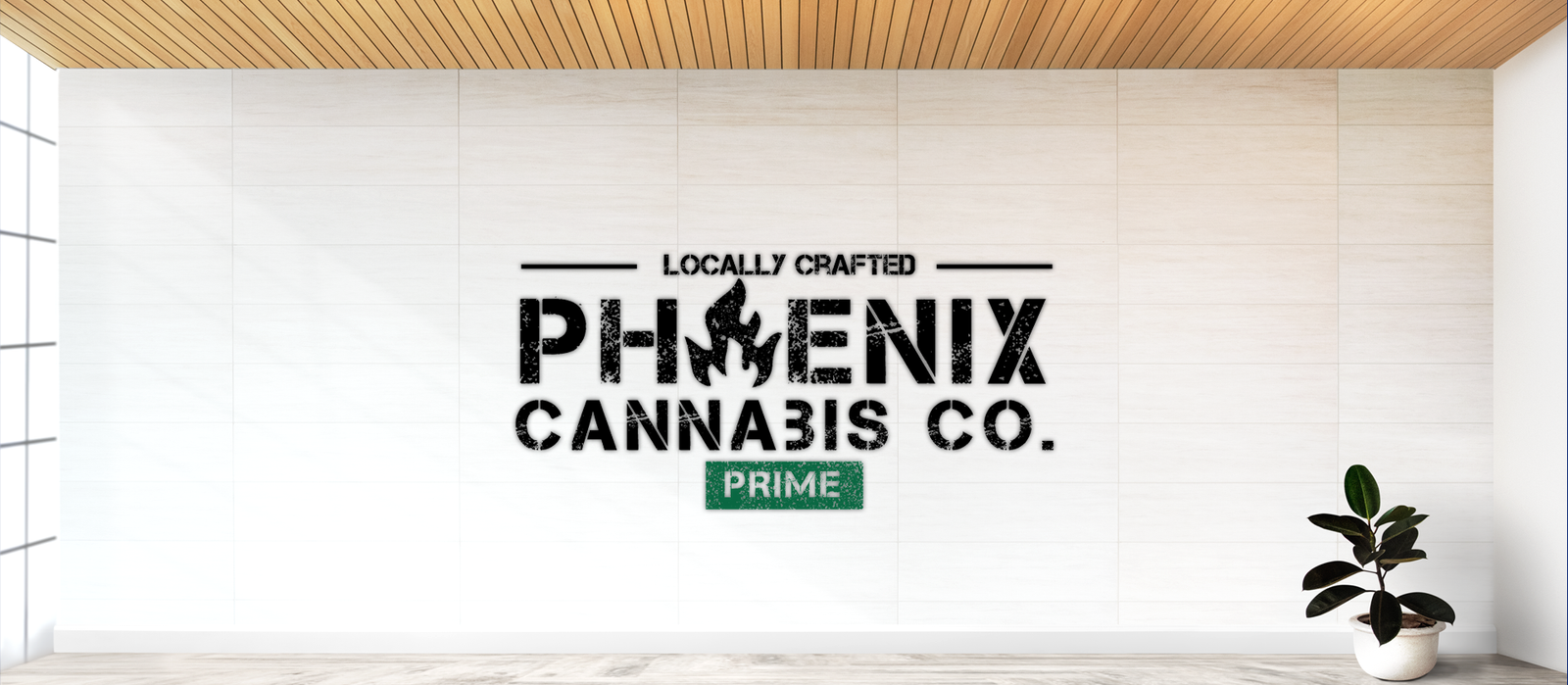
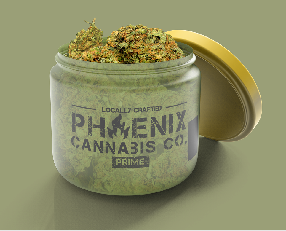
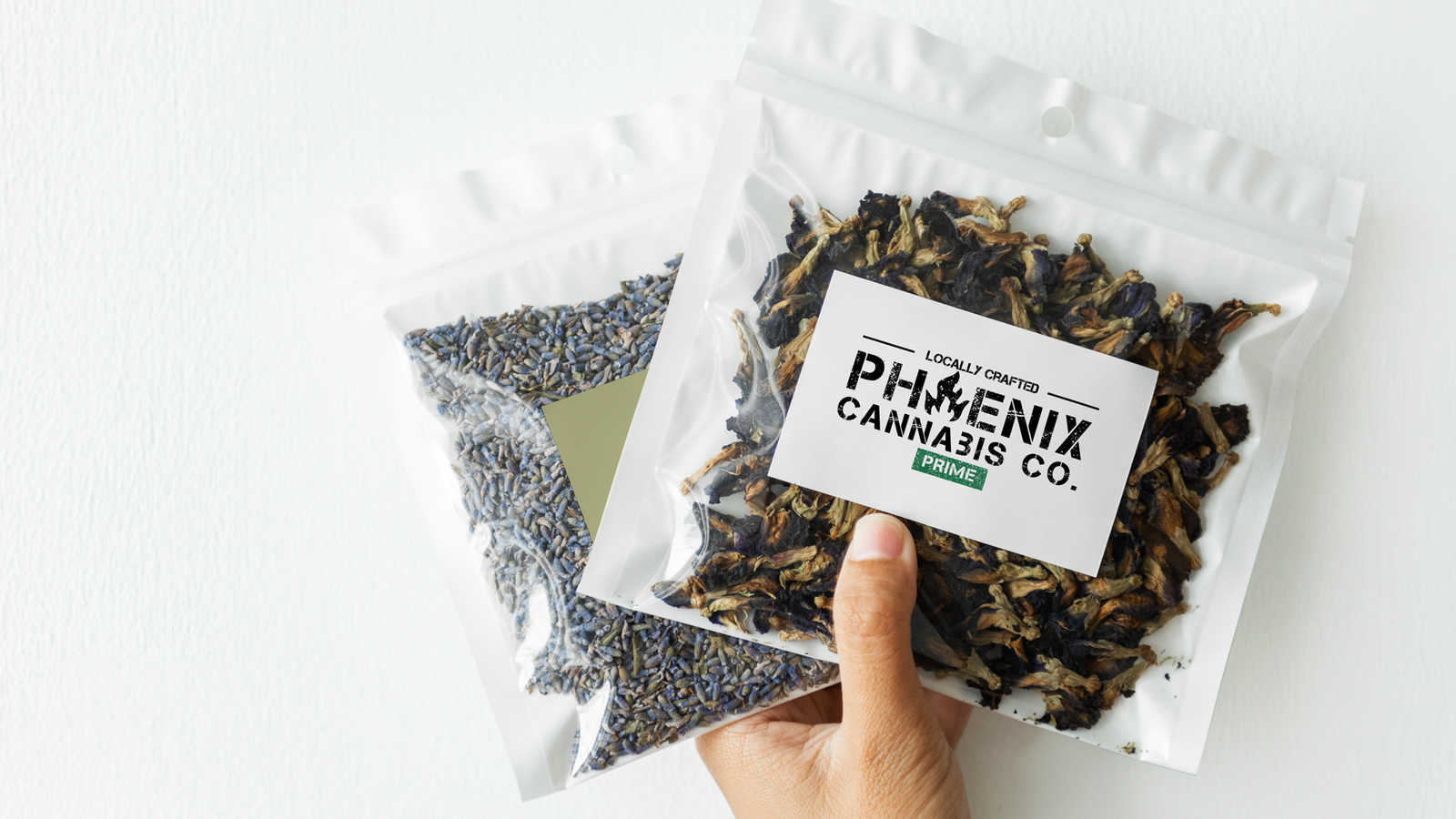
To address the client’s needs, we crafted a visually striking logo that encapsulated The Phoenix Cannabis Co.’s essence. We drew inspiration from a provided image while ensuring distinctiveness. The design incorporated a marijuana leaf, staying true to the brand’s identity, and explored a black/gold color palette, emphasizing sophistication.
Key Visuals
Premium Palette
Highlighting the sophisticated black and gold color scheme, exuding premium quality.
Nature's Essence
Showcasing the marijuana leaf, symbolizing the brand’s commitment to quality and authenticity.
Local Vibes
Infusing a sense of locality to resonate with the brand’s roots and authenticity.
Enjoyable Experience
Showcasing the marijuana leaf, symbolizing the brand’s commitment to quality and authenticity.
+
=
Initial “P”
fire
Logo Meaning
The logo integrates a marijuana leaf, representing the brand’s commitment to high-quality cannabis products. The absence of a Phoenix (bird) icon aligns with legal restrictions while allowing for a unique and ownable design.
Safe Area
Ensure a clear space around the logo equal to the height of the marijuana leaf element. This maintains visibility and legibility in various applications.
Typography
The selected font style complements the brand’s attributes—trustworthy, real, and cool. The typography enhances readability and aesthetic appeal, contributing to the overall brand identity.