
About the Client The logo design process which MultiverseSol nurtured with The 2024 LMASE Regional Conference...
Read More
Exploring Options
The reason for this discussion is to expose a bunch of designs with logos that use compasses, page corners, and girlish elements. The principal phase was focused on delimiting 2 distinct color compositions.

Client Feedback & Refinement
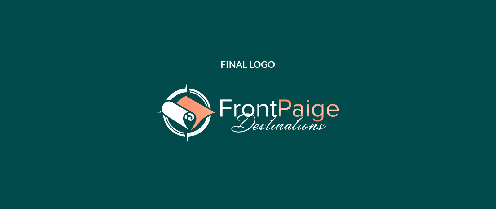
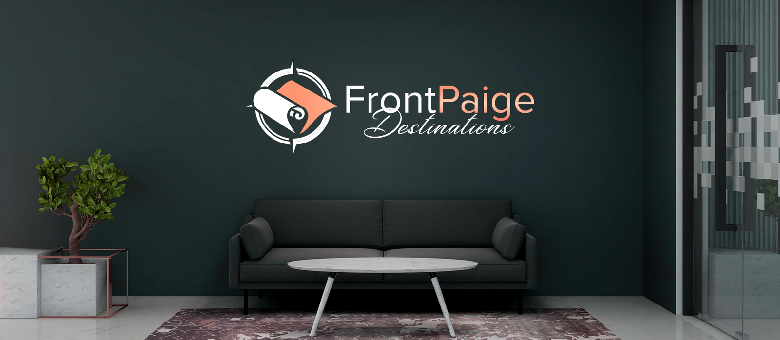
We had a feedback sessions and communication to make the logo better and finally it became the one that evokes the brand of FrontPaige Destinations well.

Bold Adventure
We thought about using blue in our emblem to convey the impression of reliability and steadfastness while introducing the grays to add class and sophistication. It was also considered to add orange into the logo in order to inject energy, adventure, and enthusiasm.

Sophisticated Explorer
This palette was a mix of blue, rose gold and white. Tear green brought to mind a soothing green and adventurous vibe, and the pale gold evoked a more gentleman-like energy and the white created clean lines.


Nev Santana
Project Overview Multiversesol recently partnered with Nev Santana, a Brooklyn-based author and creative storyteller, to redesign...
Read More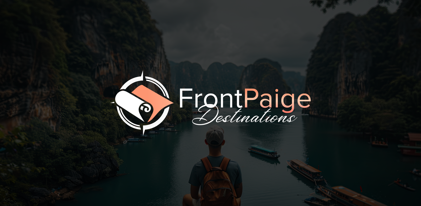
Front Paige Destination
About FrontPaige Destinations specializes in curating truly memorable times spent while exploring the world, and focuses...
Read More